Pulling and Visualizing Wealth & Poverty Data
"Despite decades of declining poverty rates, an estimated 8.4% of the global population remains in extreme poverty as of 2019, and progress has slowed in recent years [1]. But data on poverty remain surprisingly sparse, hampering efforts at monitoring local progress, targeting aid to those who need it, and evaluating the effectiveness of antipoverty programs [2]. Previous works [3,4] have demonstrated using computer vision on satellite images and street-level images to predict economic livelihood." [5]
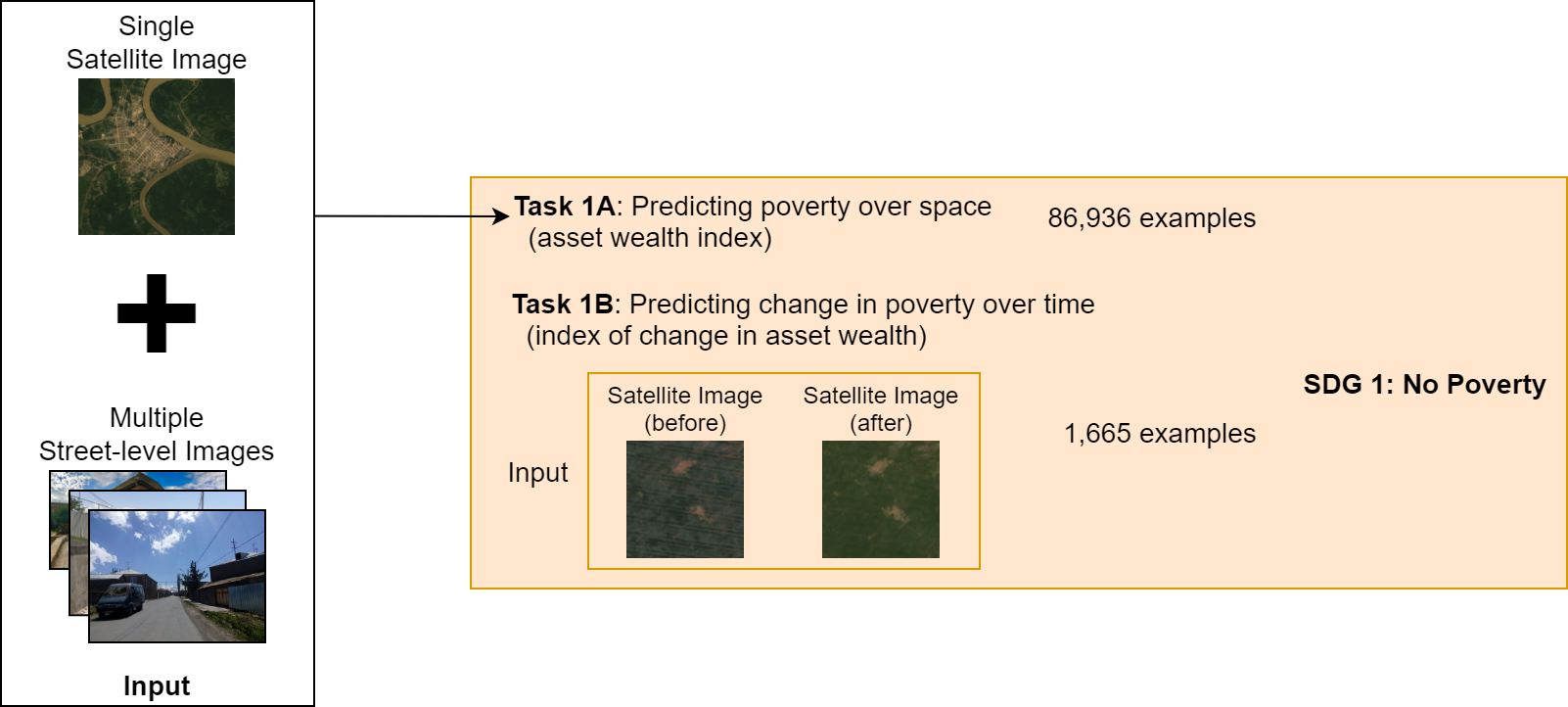
In this notebook, we will pull a 2021 benchmark dataset from the Stanford Sustainability and AI Lab called "SustainBench". This dataset contains a variety of datasets related to sustainability, including datasets related to poverty and wealth mapping. More info on it can be found on the project website, the GitHub repo, or the arXiv paper. The data comes from surveys collected by the Demographic and Health Surveys (DHS) Program from USAID (RIP 😢). Nationally represenative surveys are conducted every few years in dozens of low- and middle-income countries (LMICs) around the world. Surveyors will go out to urban neigborhoods or rural communities and survey a few dozen random households within that "cluster". The anonymized household level data is geotagged with the coordinates of the cluster with a jitter to further protect privacy. The jitter is within a 2km radius for urban clusters, and a 5km radius for rural clusters. We will focus on Task 1A from SustainBench, mapping wealth and poverty spatially. SustainBench has made our lives easier by collating this data for 80k+ clusters and making it publicly avaiable, but you can request the original and latest household-level data directly from the DHS on their website, it takes just a couple of days to get approved.
In subsequent notebooks, we then will pull in geospatial foundation models such as SatCLIP and MOSAIKS. We will then use these models to extract features from the poverty and wealth mapping dataset, and then train a linear classifier on top of these features to predict the poverty and wealth labels. We will then evaluate the performance of each model on the test set.
Learning Outcomes
- Identify benchmark datasets for a task of interest
- Pull in the relevant data
- Visualize it
References
[1] United Nations Department of Economic and Social Affairs. The Sustainable Development Goals Report 2021. The Sustainable Development Goals Report. United Nations, 2021 edition, 2021. ISBN 978-92-1-005608-3. doi: 10.18356/9789210056083. URL https://www.un-ilibrary.org/content/books/9789210056083.
[2] M. Burke, A. Driscoll, D. B. Lobell, and S. Ermon. Using satellite imagery to understand and promote sustainable development. Science, 371(6535), 2021. doi: 10.1126/science.448abe8628. URL https://www.science.org/doi/10.1126/science.abe8628.
[3] C. Yeh, A. Perez, A. Driscoll, G. Azzari, Z. Tang, D. Lobell, S. Ermon, and M. Burke. Using publicly available satellite imagery and deep learning to understand economic well-being in Africa. Nature Communications, 11(1), 5 2020. ISSN 2041-1723. doi: 10.1038/s41467-020-58916185-w. URL https://www.nature.com/articles/s41467-020-16185-w.
[4] J. Lee, D. Grosz, B. Uzkent, S. Zeng, M. Burke, D. Lobell, and S. Ermon. Predicting Livelihood Indicators from Community-Generated Street-Level Imagery. Proceedings of the AAAI Conference on Artificial Intelligence, 35(1):268–276, 5 2021. ISSN 2374-3468. URL https://ojs.aaai.org/index.php/AAAI/article/view/16101.
[5] C. Yeh, C. Meng, S. Wang, A. Driscoll, E. Rozi, P. Liu, J. Lee, M. Burke, D. Lobell, and S. Ermon, “SustainBench: Benchmarks for Monitoring the Sustainable Development Goals with Machine Learning,” in Thirty-fifth Conference on Neural Information Processing Systems, Datasets and Benchmarks Track (Round 2), Dec. 2021. [Online]. Available: https://openreview.net/forum?id=5HR3vCylqD.
Environment Setup
# data reading and manipulation
import os
import numpy as np
import pandas as pd
import geopandas as gpd

# visualization
import matplotlib.pyplot as plt
from mpl_toolkits.basemap import Basemap

print("imported")
imported
Read in and Visualize Dataset
Every good data scientists knows that you need to visualize your data to understand it.
# read in the csv file
# remove modify the path as needed
labels_path = ('data/dhs_final_labels.csv')
df = pd.read_csv(labels_path)

# now convert this regular dataframe into a nifty geopandas dataframe
# learn more about what a "geo" dataframe is here: https://geopandas.org/en/stable/docs/user_guide/data_structures.html#geodataframe
# it's based on Python Shapely geometries: https://shapely.readthedocs.io/en/stable/geometry.html
# which is in turn based on C/C++ GEOS geometries: https://libgeos.org/usage/
# which is in turn based on the OGC Simple Features standard: https://en.wikipedia.org/wiki/Simple_Features
# which describes well-known text (WKT) representations of vector geometry: https://en.wikipedia.org/wiki/Well-known_text_representation_of_geometry
# fun!
gdf = gpd.GeoDataFrame(df, geometry=gpd.points_from_xy(df.lon, df.lat), crs="EPSG:4326")
gdf.head()
| DHSID_EA | cname | year | lat | lon | n_asset | asset_index | n_water | water_index | n_sanitation | ... | n_under5_mort | women_edu | women_bmi | n_women_edu | n_women_bmi | cluster_id | adm1fips | adm1dhs | urban | geometry | |
|---|---|---|---|---|---|---|---|---|---|---|---|---|---|---|---|---|---|---|---|---|---|
| 0 | AL-2008-5#-00000001 | AL | 2008 | 40.822652 | 19.838321 | 18.0 | 2.430596 | 18.0 | 3.444444 | 18.0 | ... | 6.0 | 9.500000 | 24.365000 | 18.0 | 18.0 | 1 | NaN | 9999 | R | POINT (19.83832 40.82265) |
| 1 | AL-2008-5#-00000002 | AL | 2008 | 40.696846 | 20.007555 | 20.0 | 2.867678 | 20.0 | 4.700000 | 20.0 | ... | NaN | 8.600000 | 23.104000 | 20.0 | 20.0 | 2 | NaN | 9999 | R | POINT (20.00756 40.69685) |
| 2 | AL-2008-5#-00000003 | AL | 2008 | 40.750037 | 19.974262 | 18.0 | 2.909049 | 18.0 | 4.500000 | 18.0 | ... | NaN | 9.666667 | 22.387778 | 18.0 | 18.0 | 3 | NaN | 9999 | R | POINT (19.97426 40.75004) |
| 3 | AL-2008-5#-00000004 | AL | 2008 | 40.798931 | 19.863338 | 19.0 | 2.881122 | 19.0 | 4.947368 | 19.0 | ... | NaN | 9.952381 | 27.084500 | 21.0 | 20.0 | 4 | NaN | 9999 | R | POINT (19.86334 40.79893) |
| 4 | AL-2008-5#-00000005 | AL | 2008 | 40.746123 | 19.843885 | 19.0 | 2.546830 | 19.0 | 4.684211 | 19.0 | ... | 6.0 | 8.937500 | 24.523125 | 16.0 | 16.0 | 5 | NaN | 9999 | R | POINT (19.84388 40.74612) |
5 rows × 22 columns
# I wanted visualize with lonboard from Development Seed built on top of deck.gl, but I couldn't get it working in Kaggle
# learn more about it at https://github.com/developmentseed/lonboard or in the documentation here https://developmentseed.org/lonboard/latest/
# Discussion about this issue here: https://github.com/developmentseed/lonboard/discussions/750
# bonus if you can figure out an interactive viz in Kaggle!
# instead we'll use a static visualization below:
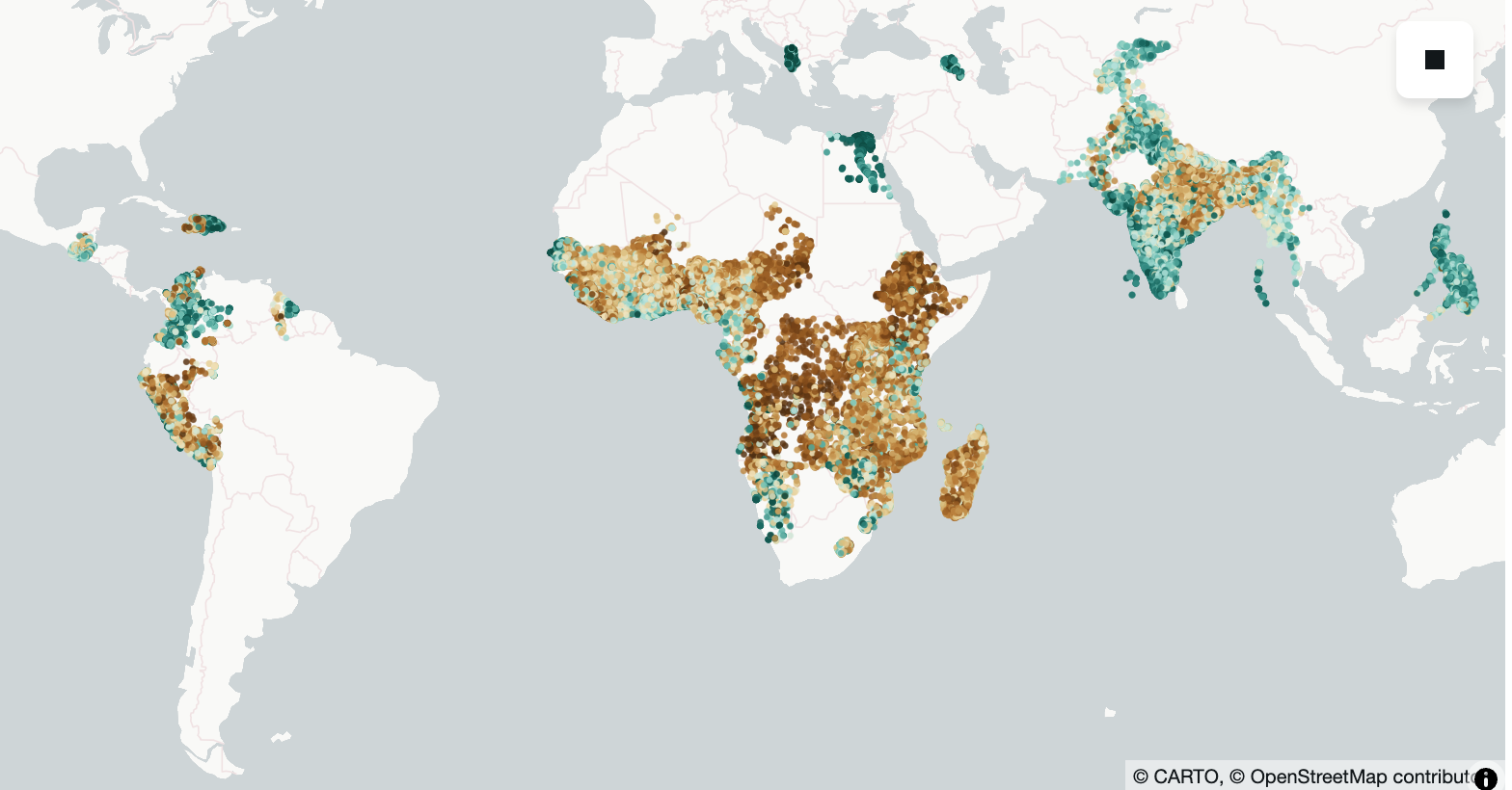
fig, ax = plt.subplots(1, figsize=(12, 6))
m = Basemap(projection='cyl', resolution='c', ax=ax)
m.drawcoastlines()
ax.scatter(df['lon'], df['lat'], c=df['asset_index'], s=1)
ax.set_title('Mean Asset Index Labels per DHS Cluster')
Text(0.5, 1.0, 'Mean Asset Index Labels per DHS Cluster')

Assignment
- Answer the following questions: What are some countries missing from this dataset? Why do you think DHS didn't include them? Could this lead to potential biases? 🤔
- Visualize another variable from the labels file. Which one did you choose and why? How does the distribution compare to the asset index? Do you think there's a correlation between the two variables you chose.
Bonus Assignment
Recreate the visualization above using an interactive geospatial Python visualization library (ie leaflet, carto, lonboard, etc etc..). Add your code below.
from lonboard import viz
import numpy as np
import matplotlib as mpl
from palettable.colorbrewer.diverging import BrBG_10  # diverging palette
from lonboard import Map, ScatterplotLayer
from lonboard.colormap import apply_continuous_cmap

# gdf: GeoDataFrame with Point geometry + column "asset_index"

vals = gdf["asset_index"].to_numpy(dtype=float)

# Diverging normalization: center at the median (use 0.0 if you want “diverge around zero”)
norm = mpl.colors.TwoSlopeNorm(
    vmin=np.nanmin(vals),
    vcenter=np.nanmedian(vals),
    vmax=np.nanmax(vals),
)
vals_0_1 = norm(vals)  # -> array in [0, 1]

layer = ScatterplotLayer.from_geopandas(gdf)
layer.radius_min_pixels = 2
layer.get_fill_color = apply_continuous_cmap(vals_0_1, BrBG_10, alpha=0.85)

m = Map(layer)
m
<lonboard._map.Map object at 0x36bcea350>
Convert Notebook to HTML
# supress warnings
import warnings
warnings.filterwarnings("ignore")

# export to HTML for webpage
import os
os.system('jupyter nbconvert --to html pt1-wealthdata.ipynb --HTMLExporter.theme=dark')
[NbConvertApp] Converting notebook pt1-wealthdata.ipynb to html
[NbConvertApp] WARNING | Alternative text is missing on 1 image(s).
[NbConvertApp] Writing 510887 bytes to pt1-wealthdata.html
0